MIGHTY NETWORKS
A brand refresh for a SaaS company building an all-in-one platform for unique hosts and their vibrant communities.
Art direction | brand design

Overview
The goal of this project was to reimagine the visual brand of Mighty Networks, a Saas company building an all-in-one community platform for hosting online communities, courses, events and more.
My Role
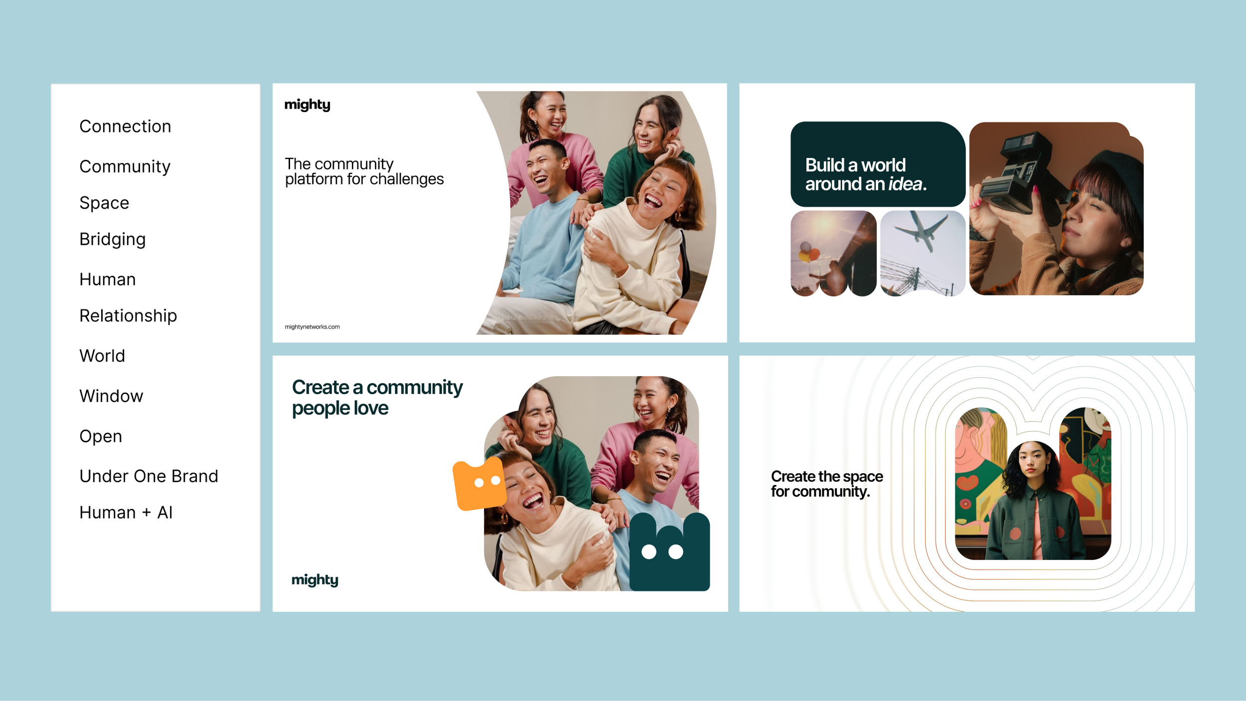
Brand Exploration: Researched peers and created mood boards for internal presentations and stakeholder review
Art Direction: Partnered with a contract designer to conceptualize new graphic elements for brand visuals
Brand Design: Applied the approved brand direction to a new homepage design, ads and social posts
The Concept
When working on a brand refresh, I always like to start with a concept to act as the foundation. We landed on the concept of a portal as the foundational element for the new Mighty brand: “gateways into communities shaped by real people, vivid interests, and emotional connection.”
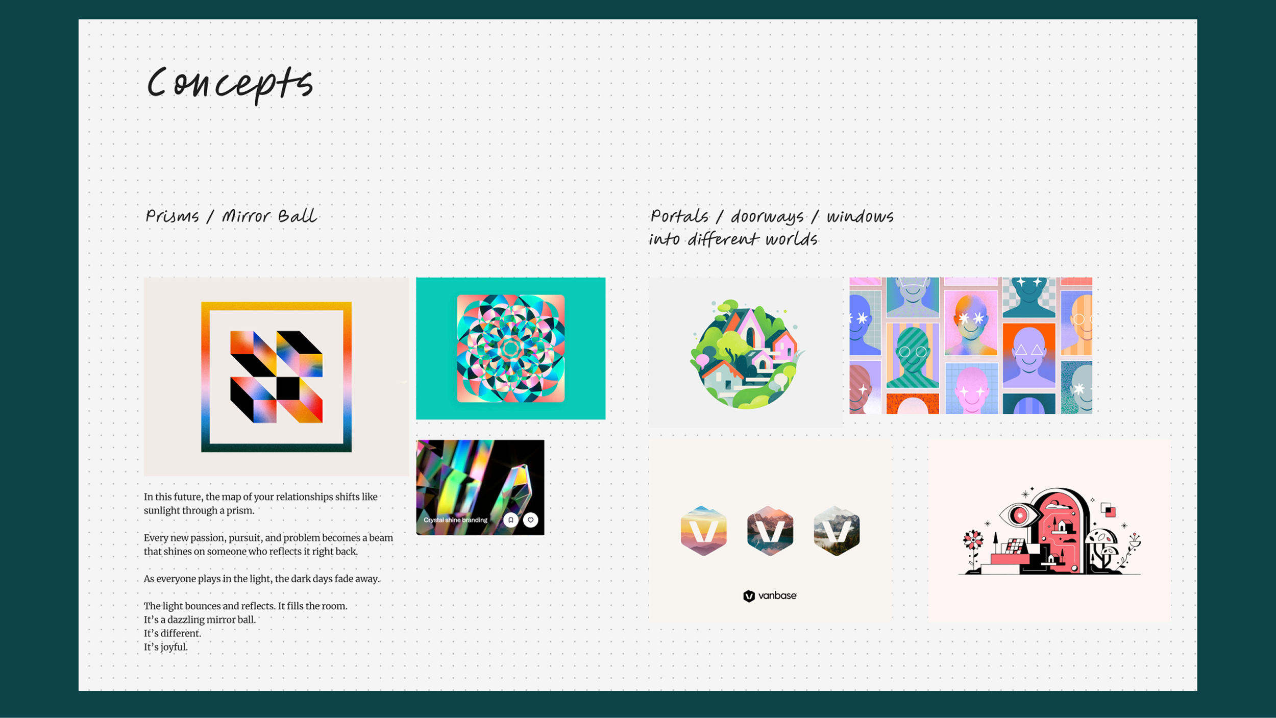
Concepts for graphic elements started with a mood board.
The designer was briefed on the concepts and provided additional context about Mighty, including keywords and brand attributes.
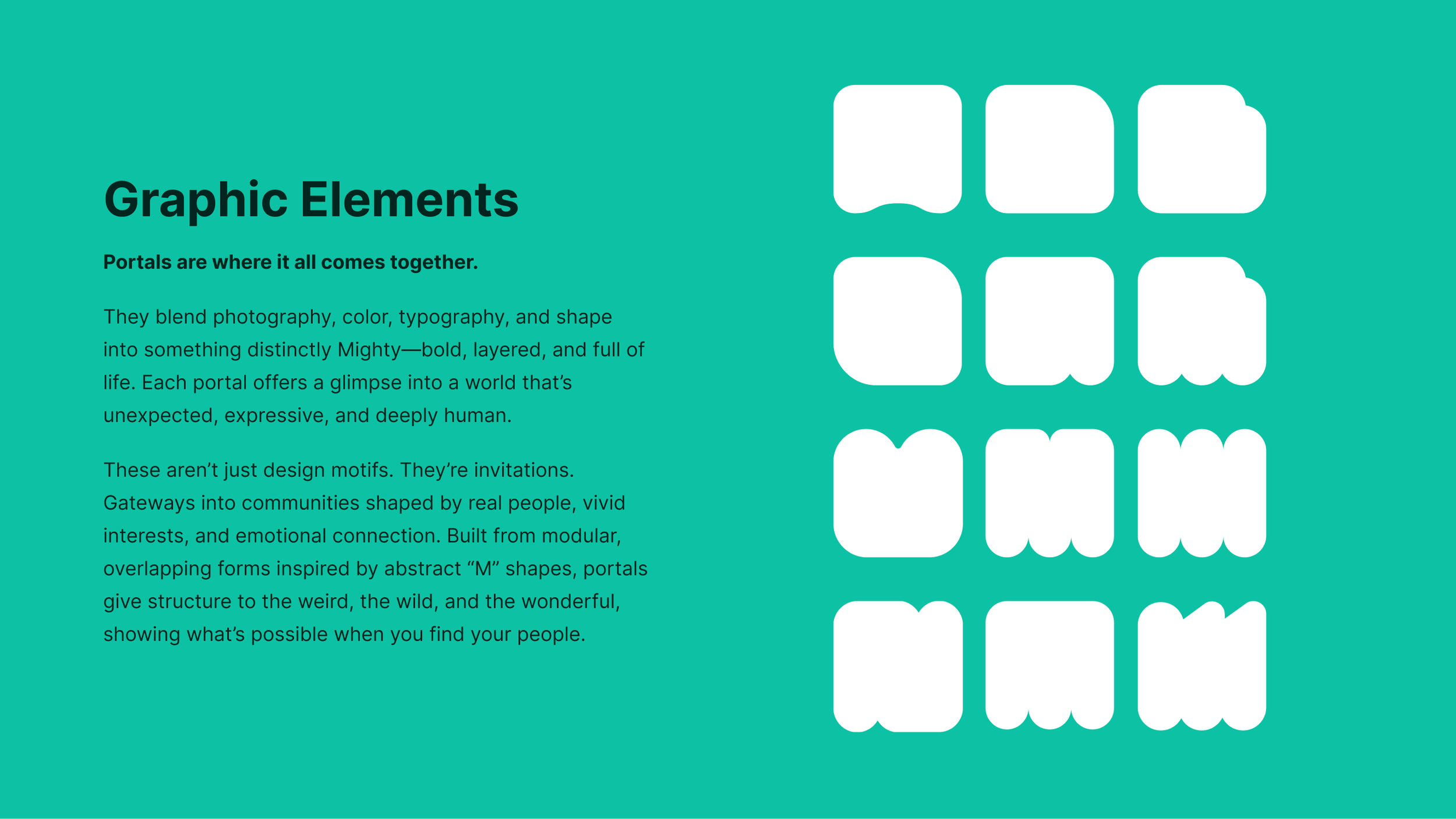
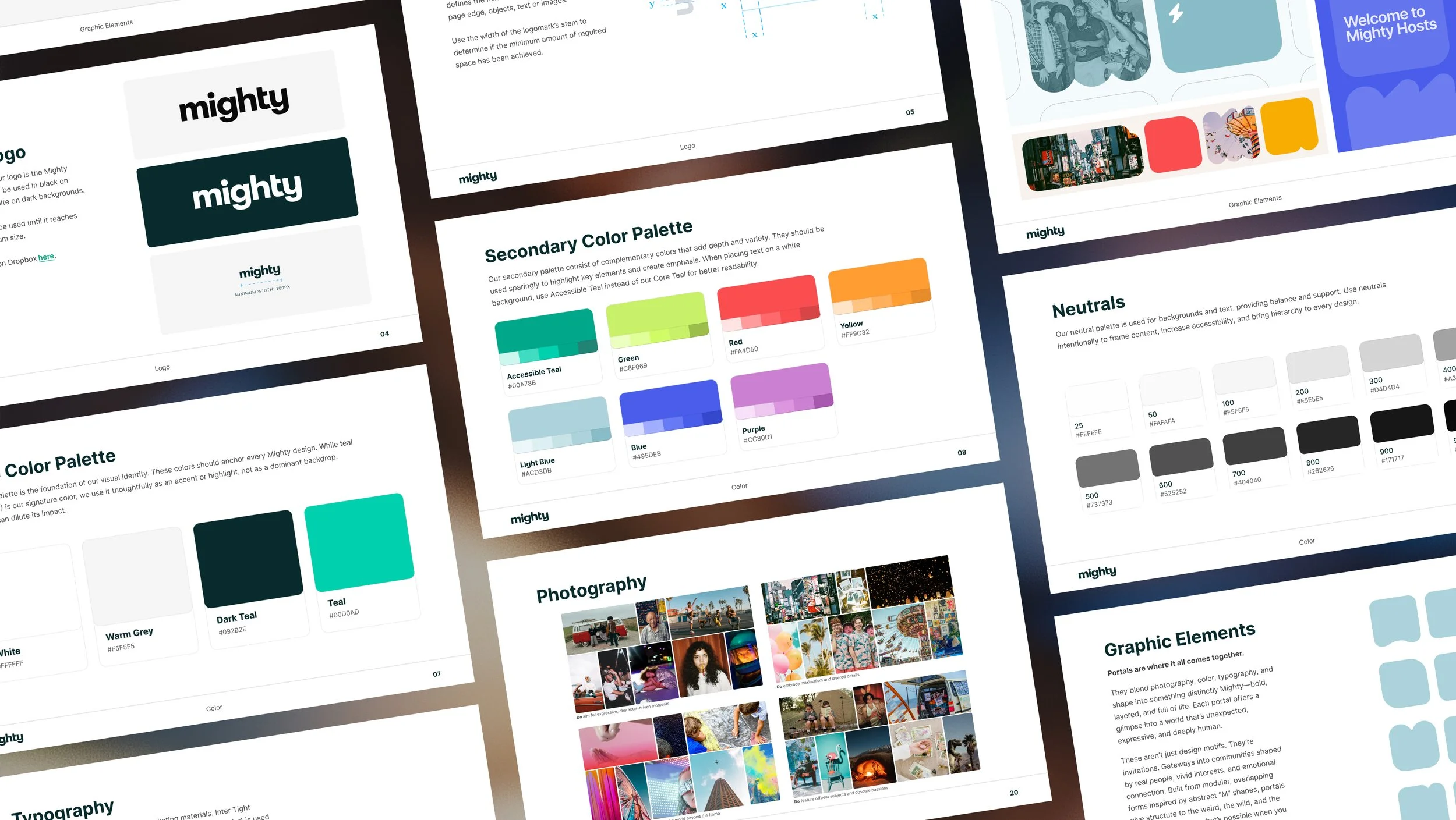
We landed on a set of elements, abstracted letter Ms, which are used as "portals".
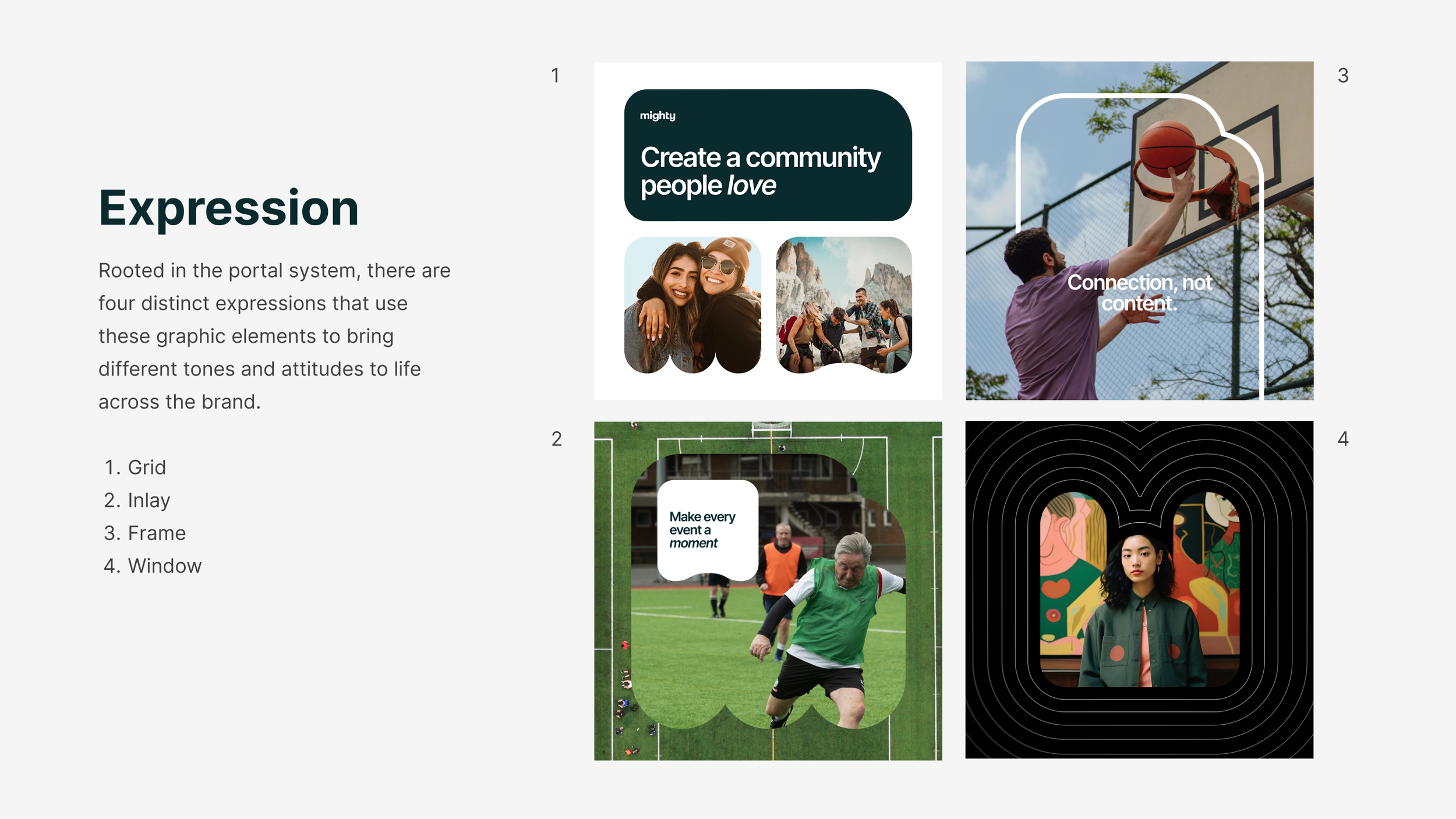
We defined four distinct expressions of the portal shapes to be used within designs.
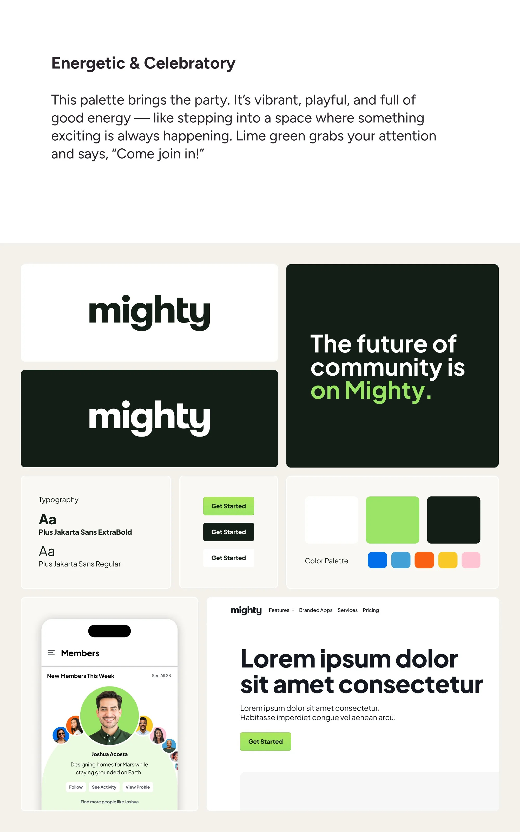
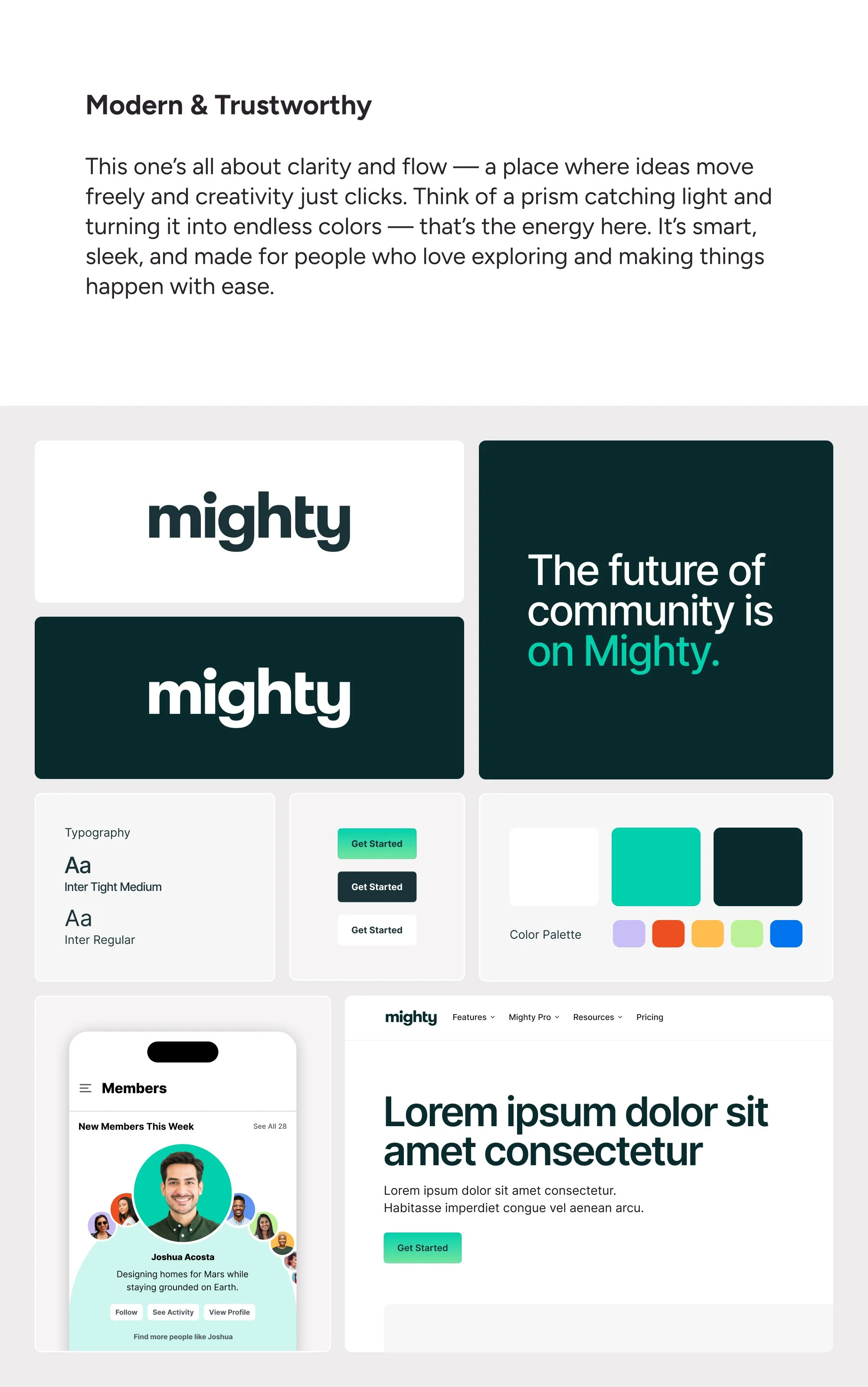
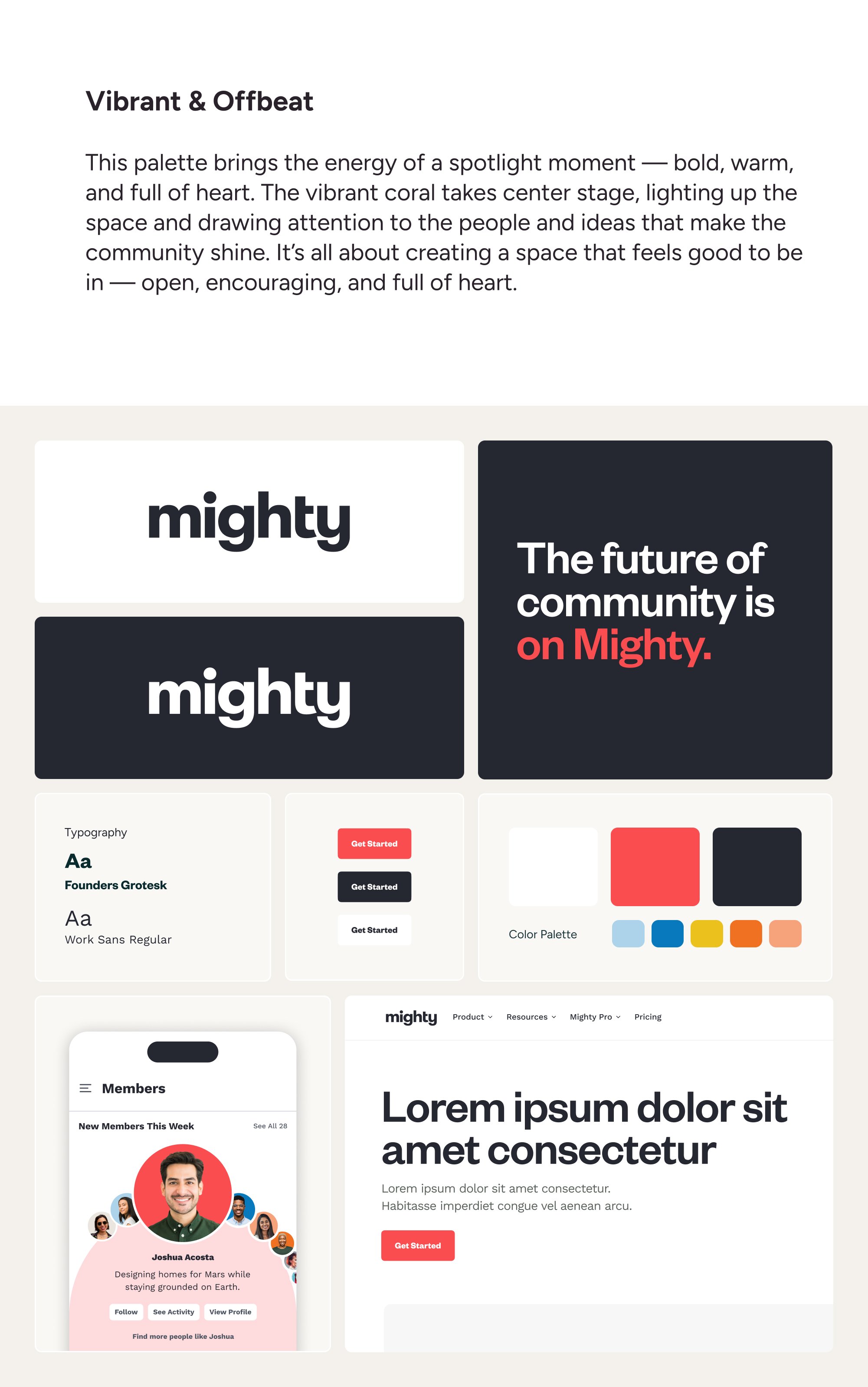
Color and Type Exploration
Alongside the development of graphic element concepts, I explored new color palettes and typefaces to pair with our new visuals.
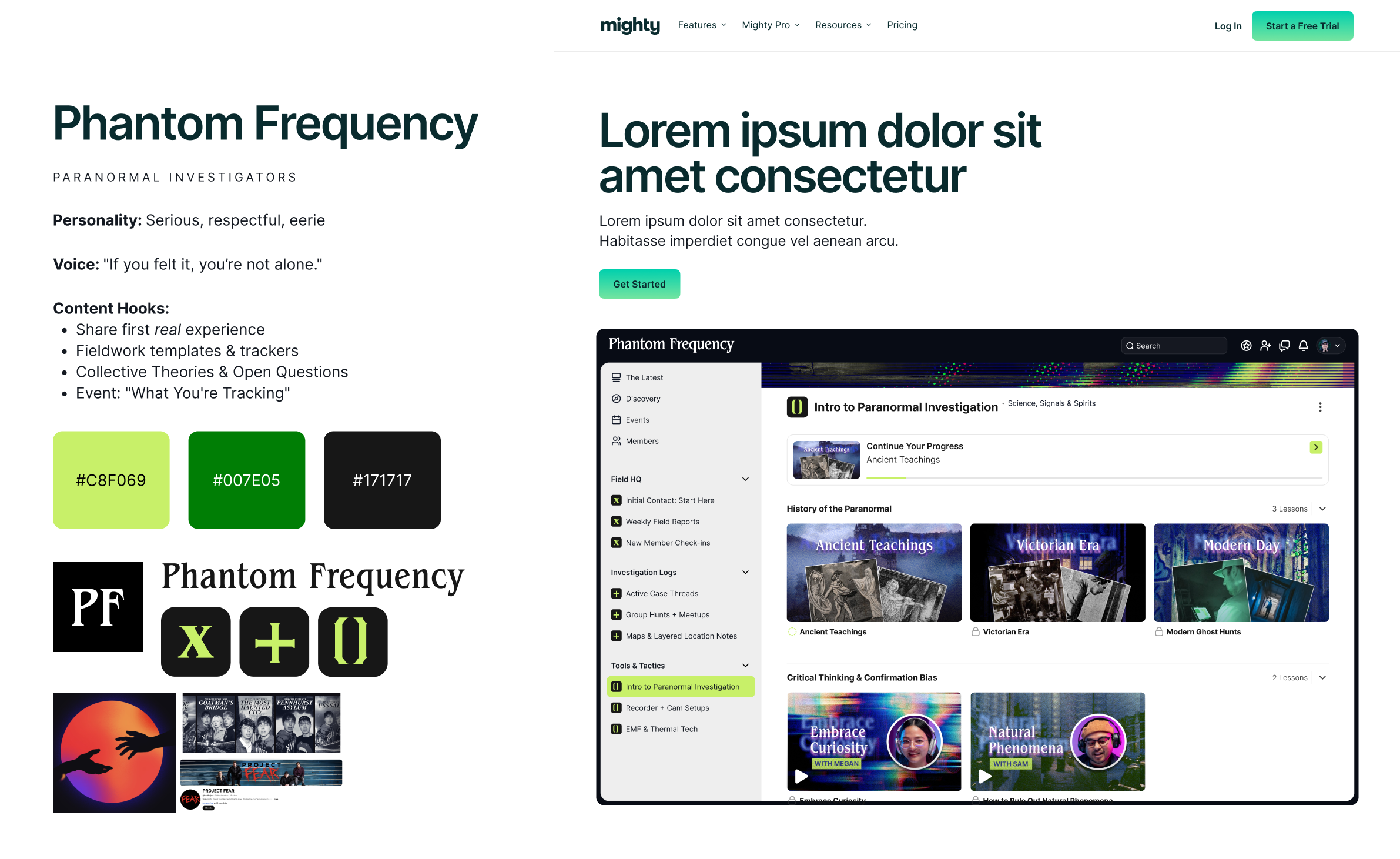
Faux Brands
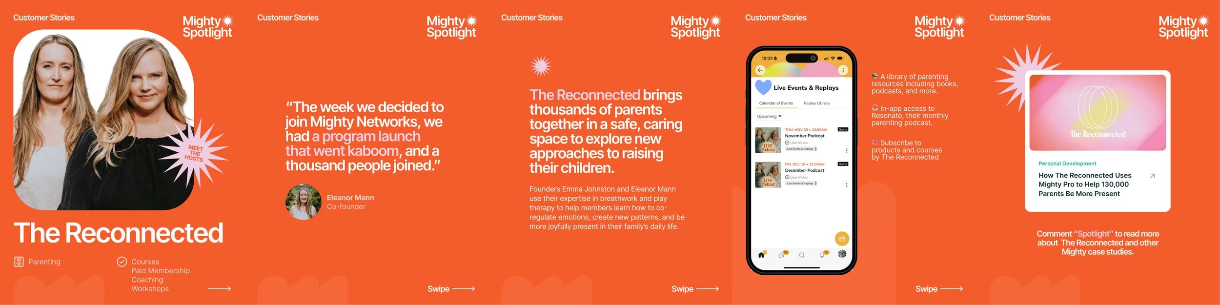
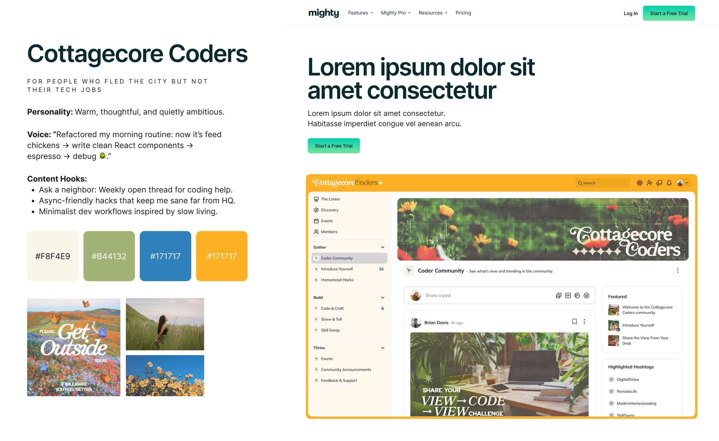
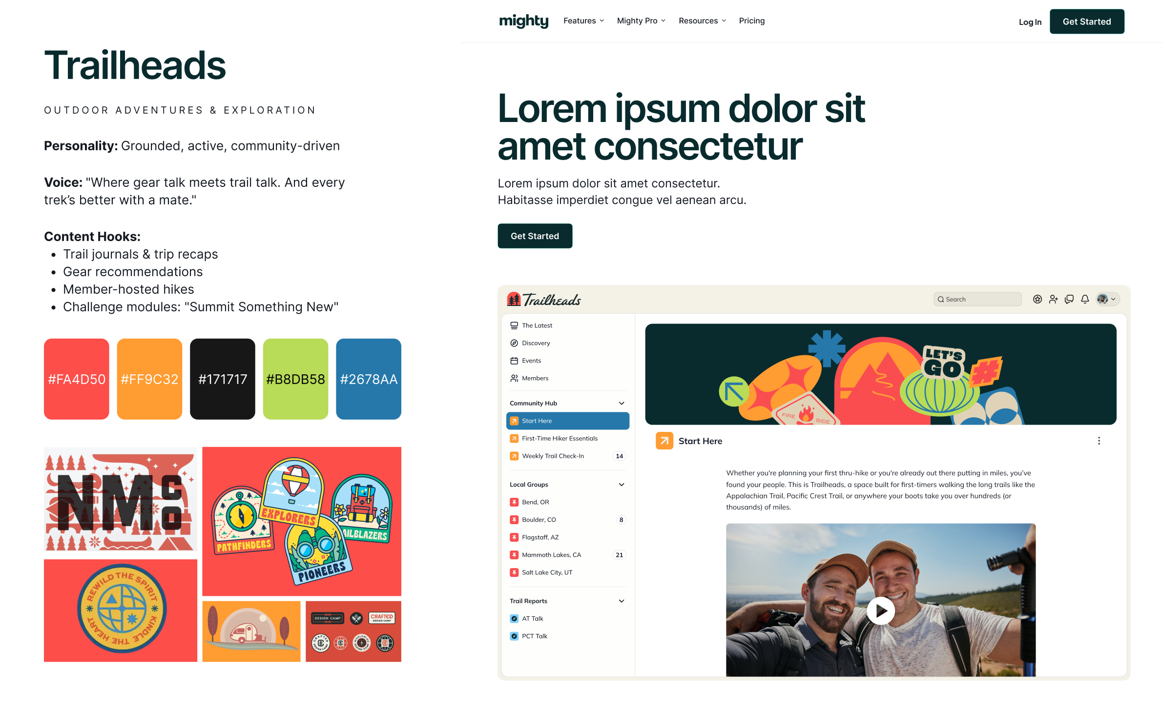
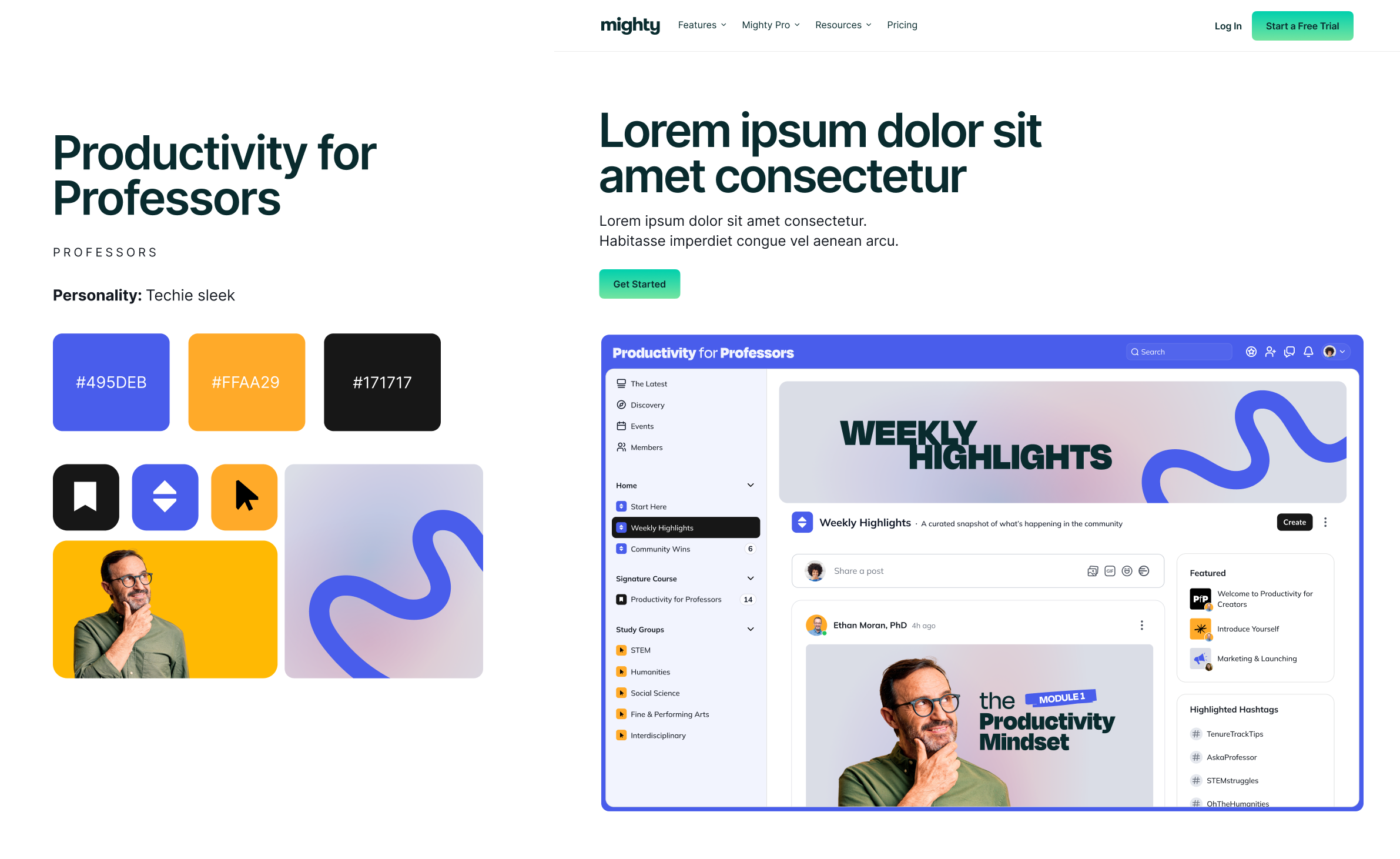
A major piece of the Mighty website is showcasing the actual product. As part of the brand refresh, we developed a series of faux communities in order to illustrate all the different ways the software can be used. This entailed creating graphics to mimic the real, vibrant communities that live on Mighty Networks, including assets for activity feeds, events, courses and more. I also storyboarded specific product screens and partnered with a motion designer to bring them to life in key areas across the website.
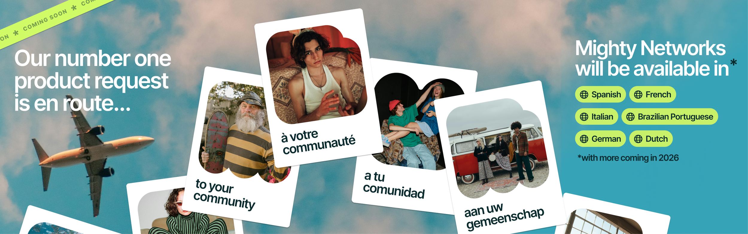
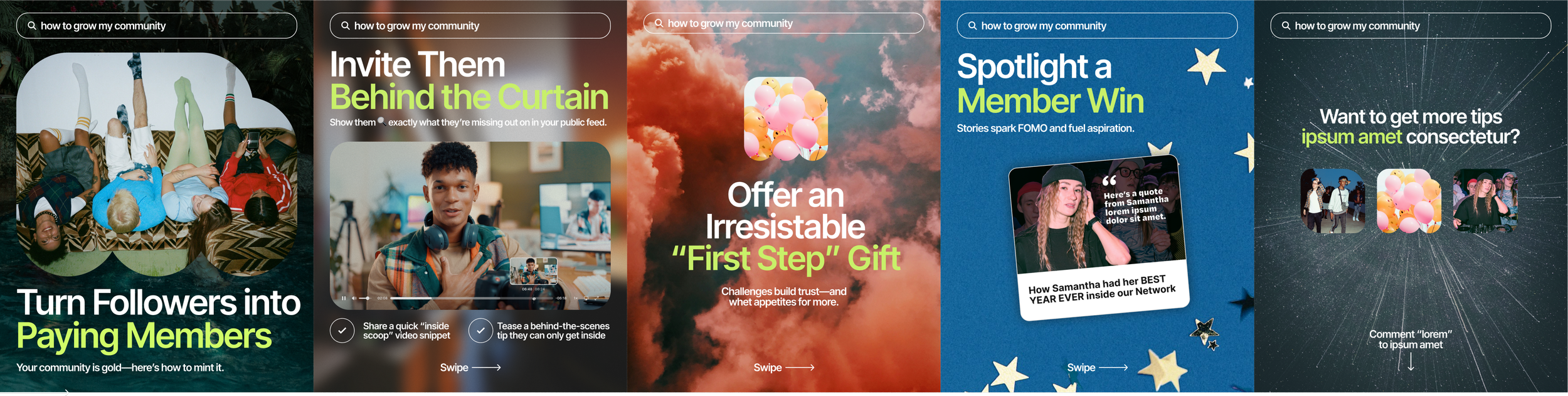
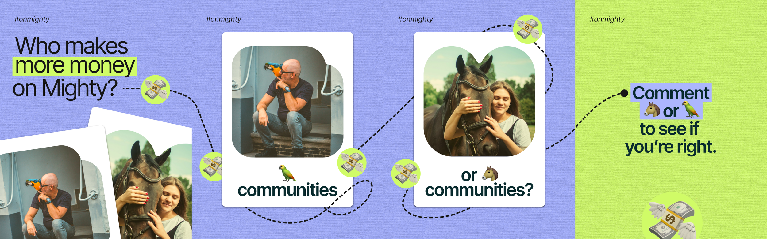
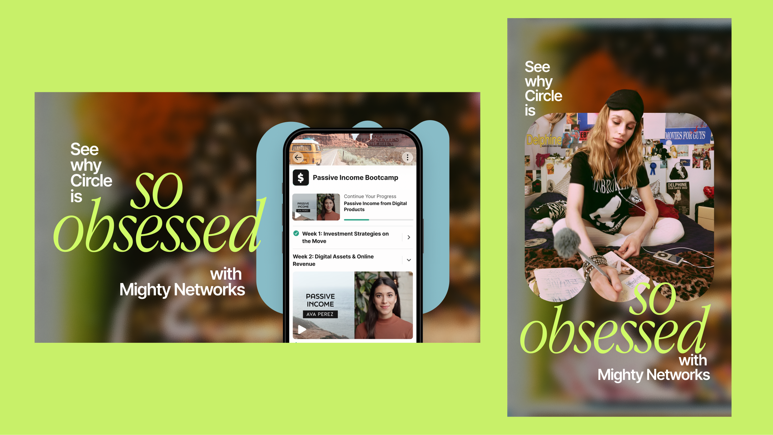
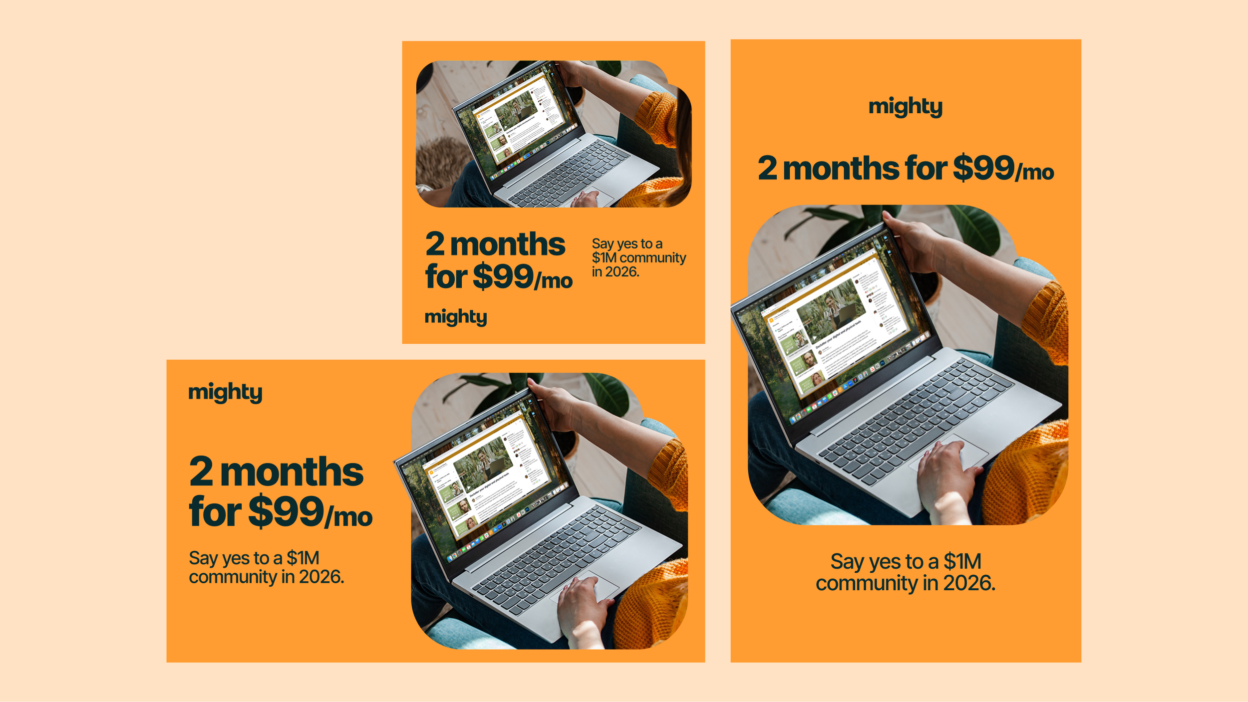
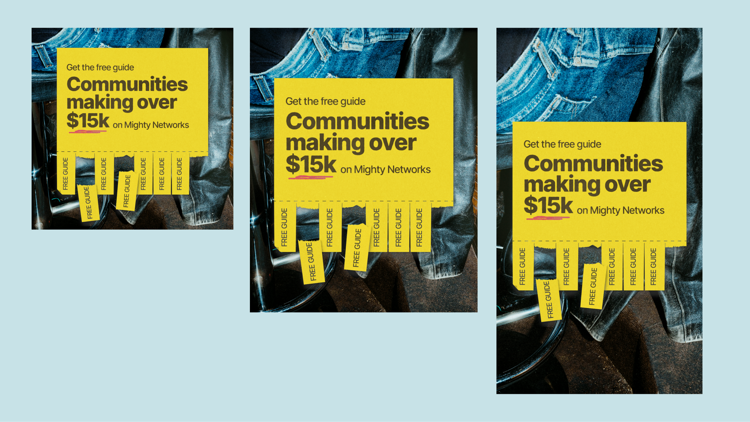
Brand in Action : Paid Ads

Brand in Action : Social Posts